Fluid & Layout Studio: CSS clamp(), Grid, and Flexbox
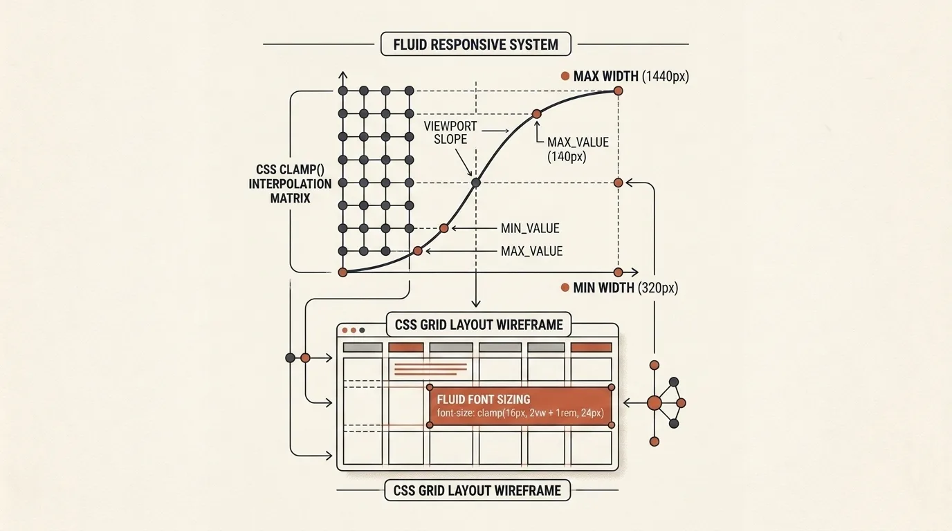
Designing responsive web layouts traditionally required writing dozens of verbose @media (max-width: ...) queries for every screen breakpoint. This resulted in bloated CSS files and abrupt, jumpy transitions between screen sizes.
Modern CSS introduces the clamp() function, enabling fluid typography and responsive spacing. However, calculating the linear interpolation formula by hand requires complex math.
What is Fluid & Layout Studio
Fluid & Layout Studio is a browser-based tool for designing fluid typography and responsive CSS layouts. The studio combines a CSS clamp() expression calculator, a visual CSS Grid builder, and a Flexbox container generator:
- Fluid Typography & Spacing Calculator: Generates precise
clamp(min, val, max)functions for fonts and margins. - Interactive Viewport Slider: Tests scaling smoothness across resolutions from 320px to 1920px in real time.
- Visual CSS Grid & Flexbox Builder: Graphically design columns, rows, gaps, and alignment rules.
- CSS Token Export: Exports ready-to-use
:rootvariables, SCSS mixins, and Tailwind CSS classes.
The Math Behind Fluid clamp()
The clamp(MIN, VAL, MAX) function takes three arguments:
- MIN — Minimum allowed font or spacing value (e.g.,
1remor16px); - VAL — Preferred dynamic value linked to viewport width (e.g.,
2.5vw + 0.5rem); - MAX — Maximum allowed upper bound (e.g.,
2.5remor40px).
The tool automatically calculates the slope coefficient using the formula:
$$\text{Slope} = \frac{\text{Size}{\max} - \text{Size}{\min}}{\text{Viewport}{\max} - \text{Viewport}{\min}}$$
Simply specify your target font size at mobile (320px) and desktop (1440px), and the studio generates the exact CSS statement.
Visual CSS Grid and Flexbox Builder
The Layout Builder section allows you to construct complex layouts without manual property entry:
- CSS Grid: Configure column counts, flexible
frunits,minmax()boundaries,auto-fill/auto-fitrules, and gap spacing. - Flexbox Studio: Control
flex-direction(row/column),flex-wrap,justify-content, andalign-items. - Live Code Export: Copy clean, valid CSS layout code with a single click.
Real-Time Preview and Design Tokens
The interactive preview pane lets you test layout behavior instantly:
- Viewport Slider — Dragging the slider simulates window resizing from mobile screens to 4K monitors.
- Token Scale — Generates unified scales for typography (H1, H2, H3, Body, Small) and spacing tokens (xs, sm, md, lg, xl).
- One-Click Export — Copy code formatted for CSS variables, SCSS, JSON, or Tailwind CSS.
Step-by-Step Workflow: Create Fluid Typography in 1 Minute
- Set your minimum screen width (e.g.,
320px) and maximum screen width (e.g.,1440px). - Enter your desired H1 font size for mobile (
28px) and desktop (56px). - Copy the generated statement:
font-size: clamp(1.75rem, 2.5vw + 1.25rem, 3.5rem);. - Test text scaling using the interactive Viewport slider.
- Export the full CSS variable scale into your design system.
Fluid & Layout Studio eliminates media query clutter, ensures flawless responsive layouts on all devices, and accelerates your frontend workflow.
Related Tools


Frequently asked questions
What is fluid CSS clamp() typography?
The CSS clamp() function allows font sizes, paddings, and margins to scale smoothly between minimum and maximum values based on screen width without media queries.
How are clamp() coefficients calculated?
The formula computes a base REM value, a viewport slope in vw units, and offset thresholds based on your target screen resolution range.
Which layout modes are supported by the Grid generator?
The studio includes a visual CSS Grid layout builder supporting fr units, minmax(), auto-fill/auto-fit, and a Flexbox module for alignment controls.
Can I copy CSS tokens for my design system?
Yes. You can export a full scale of CSS root variables in CSS, SCSS, Tailwind CSS config, or JSON formats.
Is responsive preview supported?
Yes. An interactive viewport slider allows you to test text scaling and layout behavior in real time on screen widths from 320px to 1920px.
Does the tool work offline without server requests?
Yes. All mathematical calculations and visual preview rendering execute 100% locally in your web browser.
Is CSS clamp() cross-browser compatible?
Yes. The clamp() function is natively supported across all modern browsers (Chrome, Safari, Firefox, Edge) with over 98% global coverage.
Are configurations saved between sessions?
Yes. Your viewport ranges, typography scales, and CSS layout presets automatically persist in browser local storage.